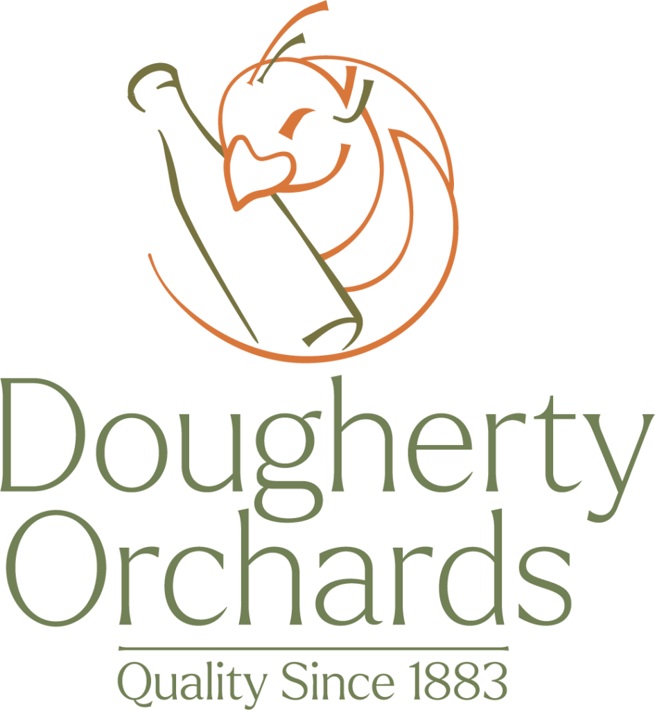
The objective of this project is to redesign the logo for Dougherty Orchards, an Indiana-based company. Through this redesign, the brand intends to expand its reach beyond the local market and venture into business-to-business transactions. The new logo will serve as a pivotal tool in this strategic transition, embodying the brand’s identity and facilitating its growth into broader markets.


The final logo was created using the idea of the peacocks that can be found at Dougherty Orchard, and their history of winemaking. The typeface “Larkin” is used for the logo mark, and the illustration incorporates parts of the design.
The color palette is inspired by the Indiana landscape.